
Visual Management - It's Right Before Your Eyes, Or Is It?
6/3/2019
Visual management is perceived as the most intuitive element of a Lean Management System (LMS). That said, we see that very few organizations have truly functional visual workplaces. Some have a few eye-catching tools hanging up. Some have lots of really professional tools hanging up and have full-time staff to maintain them. Some others have a blizzard of butcher paper on every wall with all sorts of tools. But very few are an integral part of a management system that is primarily focused on engaging the entire workforce in team based collaborative problem-solving.
What Problem Are We Trying To Solve?
To understand the most effective path to developing a visual management system we first need to appreciate how people learn new skills and its impact on developing a visual management system. Educators will generally agree that there are three major modes of taking and remembering information- auditory, visual, and tactile. While each of us has a mode that suits us best in the general population, most will learn something most deeply by doing it (tactile). The next level of understanding is visual and the smallest percentage will learn best by hearing and repeating (auditory). While visual learning is a powerful mode of absorbing information, it does not necessarily mean that the implications of that information are as well understood as they would be through tactile learning. For example, you can be shown an assembly procedure that includes instruction on which tools are necessary for each step. But only through tactile learning would you fully discover that the tool the instructor uses is not suitable for you because of significant differences in size and physical strength.
Typically, our lean education includes visiting other institutions that have achieved some level of maturity in integrating a Lean Management System into their organization. As we tour the facility, we may get some auditory background about how they got to where they are and what their future plans are. This is often done in a conference room as an introductory exercise. However, the predominant information we walk away with is what we see, including the visual tools we observe employed in various parts of the operation. Very little, if any, of this learning experience is tactile. So as we walk away and reflect on the visit, it is quite likely that most of the visual tools remain in the forefront of our mind and resonate with us as being particularly useful for a specific purpose.
As an example, several years ago I was asked to host a learning tour at a mature Lean Recreational Vehicle (RV) company for a very successful, but not so Lean, window manufacturing company (yes, non-lean companies can be financially successful, it’s just more difficult). The owner of the window manufacturing company took his private jet from Texas to Indiana, in order to view and experience this Lean organization that had many of the elements of an LMS fully integrated into how the business was run, including solid alignment from the CEO to the shop floor. Again to be candid, the window manufacturing business was very successful and profitable, with consistent year on year growth. We walked through their Strategy Deployment, Product Development, Sales, Supply Chain, Production, and finally their maintenance organization. The one tool viewed at the RV company that made its way back to the window company was a whiteboard system. The whiteboard was placed in front of the maintenance department at the RV company to indicate what repair and maintenance activities were needed. This made the mechanics aware of what repairs were needed and they could then sequence and complete the requested work. Each day the items that were taken care of were crossed off indicating that the work had been completed. A very simple and effective tool for the situation at hand. We probably covered 50-75 points of the RV company’s management system during the tour from product concept, through sales, fulfillment, and post-sales service. But only the whiteboard in front of maintenance made it into the window factory. Why? It certainly wasn’t that the window company could not use some of the improvements in other parts of the business. It was simply that the owner of the window manufacturing company walked into the RV company feeling that his business was generally successful and that he really didn’t need to change his management system. After all, he just flew his team there in his private jet for a four-hour visit! But he did have this nagging issue in the back of his head that too much equipment was down in production and that the maintenance organization was not connected well enough with the needs of production. Therefore, when he saw that visual tool in front of the maintenance department, it resonated with him and became a permanent monument of what he learned while in Indiana. We call this the shiny object syndrome. We tour other facilities and see things that attract our attention and bring them back home to display.
This experience is not unique to this one man. We all do this. We walk into these go-see experiences with a filter of what we view as our problems and latch on to the tools that we feel address that problem.
The problem with this approach is that when it’s used exclusively, we end up with visual artifacts accumulating in the workplace that individuals feel address specific needs. In some cases, those needs are well served by the tools being put in place. But there is no systemic methodology for looking across the enterprise and determining what tools are needed at each physical node in the value stream to provide the specific information needed to discern what should be happening versus what is actually happening. So while the spot approach will provide a point of light on a specific problem in a particular point in the value stream, it will not shed light across the entire value stream as to where abnormalities exist. The window company did have a problem with communication between production and maintenance. And the whiteboard did in fact help that problem. However, there were other problems that simply were never addressed, such as piles of inventory amassing between every functional area and people working feverishly to pull together complete house orders out of those piles.
The problem we have to overcome is how to look away from the shiny object that catches our eye and discipline our thinking to look at the entire enterprise and the major value streams within it. This allows us to put the right visual tool in the right place while communicating the right information. Once these tools are in place, we use them to engage the workforce and manage the operation.
So How Do We Deal With This Problem?
We’ve established that we have too much cognitive bias to design visual systems intuitively in a substantial way. We need a more rigorous and comprehensive approach to designing visual workplaces that can truly take us out of the conference rooms when we seek the truth of what is actually happening.
Here are three tools to help structure our thinking- the Business Model Canvas, Value Stream Mapping, and Pulse Point Arrows.
The Business Model Canvas (BMC) is a powerful tool to help us see the macro picture of our business. While there are several different formats for this tool, the point is to essentially instigate interactions among the major business processes in day to day operations. These include:
- Revenue Streams
- Cost Structure
- Value Proposition
- Customer Segments
- Customer Relationships
- Channels
- Key Resources
- Key Activities
- Key Partners
To help illustrate how these tools interact with one another we will expand on the example company used in “Learning to See”. Acme is a fabrication company with basic metal fabrication processes and serves the automotive industry. This is potentially what their BMC might look like.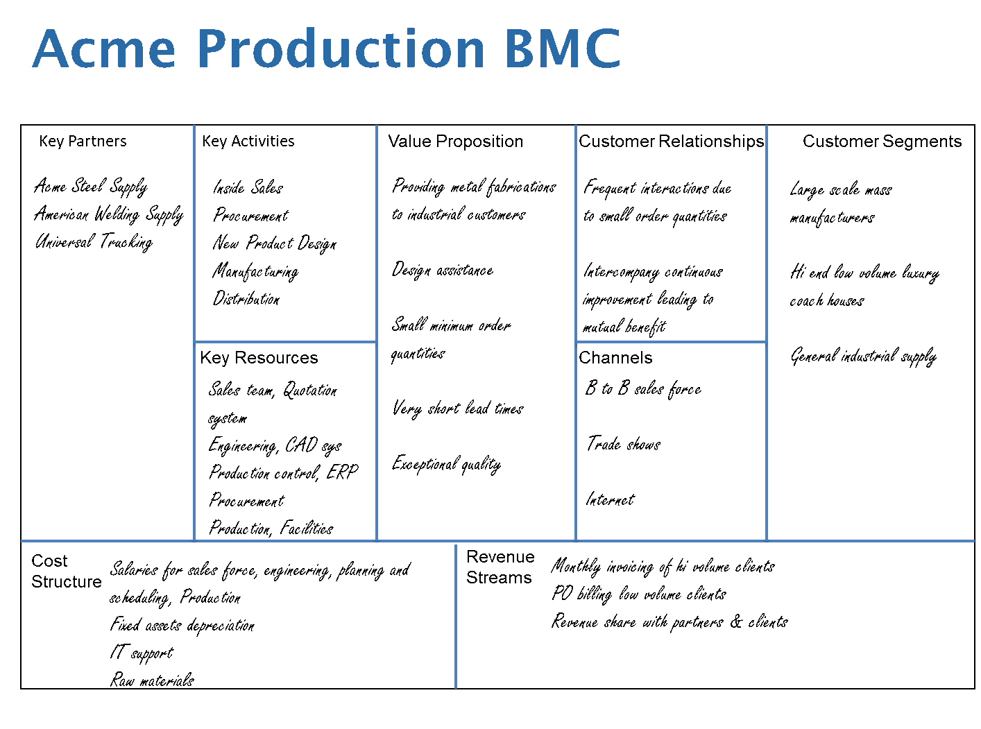
If you would like to go more deeply into the development and use of BMC’s, you can see more information through the following links:
9 Steps to Creating a Successful Business Model
Business Model Canvas Explained
From the BMC, we then prioritize the Value Streams and decide which ones to work with first. Value Stream Mapping (VSM) is a method of showing how both product and information flow through a specific part of the organization. This can be done for product development, sales and marketing, or fulfillment development. You may select a process that crosses many of the nine boxes in the canvas, or one that lands on only a few elements in particular where the interactions are not ideal. Ultimately, the goal is to be working across the entire canvas until all the major value streams in the enterprise are illustrated and there is a Value Stream Improvement Plan for each part of the business. The product fulfillment value stream may end up looking very much like this classic illustration coming out of “Learning to See”, by Mike Rother and John Shook.
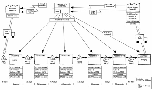
VSM can be applied to any type of organization in any industry. It is only necessary to decide what part of the business to work on, who your customer is, and what value you provide to them.
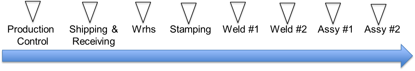
Once we have a macro picture of how our business operates (the BMC) and a more detailed picture of how a portion of it flows (the VSM), or doesn’t as the case may be, we’re ready to develop a visual management plan by creating a Pulse Point Arrow (PPA). We developed the PPA tool in 2005 while developing a training mechanism for visual management. The PPA is a graphical representation of a process walk from beginning to end that indicates where one needs to stop in order to understand how the process is performing and what visual tools would best communicate that information at that point. VSM’s are laid out according to product and information flow. The PPA tool is used to avoid primarily relying on the value stream map to extrapolate what a visual management plan should look like. The PPA is laid out in the sequence a manager would use to walk the process while avoiding zig-zagging across the facility because of the physical constraints of the facility.
Let us look at an example of a value stream map and the creation of the PPA. For starters, value stream maps are not necessarily laid out based on the physical arrangement and proximity of process steps. They are laid out sequentially, and in some cases, two processes could be in the same physical location but be on opposite ends of the map. For example, in the Acme case illustrated above, shipping and receiving are at the opposite ends of the Value stream map as they are the last and first steps in the process chronologically, although in many cases both shipping and receiving are in the same physical space. Value stream maps are laid out according to product and information flow. Because visual tools are used by those doing the work and those managing the operations, we need something that prioritizes the motion of the working and managing operations rather than the product itself.
Secondly, there is a basic principle of visual management that points to a direct relationship between the volume of inventory in a section of the value stream and the visual tools needed to see what should be happening versus what is actually happening. For example, if we have one-piece flow between operations A and B, we need very little in the way of visual management tools to know if things are flowing normally. If instead, we need to keep large quantities of materials on hand for downstream operations, then we need much more sophisticated tools to provide the visual information needed.
Finally, it is very difficult to take a team of people who have just learned how to do a value stream map and have them extrapolate the information needed to design a visual management system without simply reverting back to their favorite “shiny objects” for guidance. A more rigorous approach is needed to discipline the team’s thinking on which tools to use and where to use them. There are three steps to accomplishing this:
- Determine where the management stops will be. This is highly dependent on where inventory tends to accumulate in the value stream.
- Determine what questions need to be answered visually at each stop. There is a basic set that will be covered but also special circumstances that need to be dealt with.
- Determine which tools would best answer each question at each stop. This is based on what most effectively communicates to the workforce in that location.
In reviewing the value stream map for product fulfillment illustrated above, we can surmise that we will stop at each of the following locations:
- Production Control
- Receiving & Shipping docks
- Materials storage warehouse
- Stamping
- Weld #1
- Weld #2
- Assembly #1
- Assembly #2
Again, if we have one-piece flow, we can see normal from abnormal at a glance. However, if we have piles of inventory, or even just a choice between two possible units on which to work, we need visual tools to show what should be happening versus what is actually happening.
This is where the PPAs come in to play. We start by taking a mental walkthrough of the value stream from end to end. This helps to determine the shortest path for viewing the whole value stream and where to stop along the way. Note that you can stop anywhere, at any time, even just to say hello to someone on the line. But the Pulse Points are the mandatory stop points for your Gemba walk at a minimum and require special attention from a visual management standpoint. Our first iteration of creating our PPA looks like this:
However, if we can constrain the inventory to either pure one-piece flow or small FIFO queues between certain operations, it has an impact on the management system. The impact is one that allows us to use fewer observation points on our Gemba walks and commensurately fewer visual tools. The result is that problems in flow are identified more easily and quickly. For example, if we could create flow between Stamping, Weld #1, Weld #2, Assembly #1, and Assembly #2, our VSM will look like this:
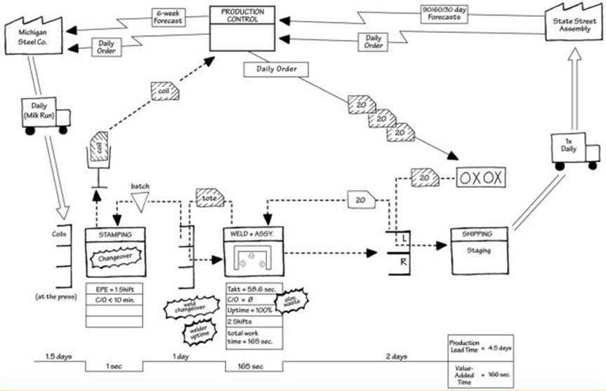
This eliminates three stop triangles from our PPA so that it ends up looking something like this:
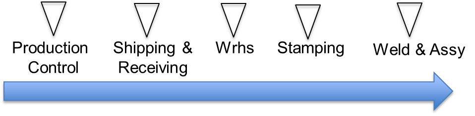
Now our Gemba walk consists of 5 major stops instead of 8, as in the previous example. We learn from this that constraining inventory, even for only a part of the VSM, makes understanding the differences between what should be happening and what is actually happening in our target value stream that much easier for both management and the workforce. Easier problem identification leads to more and better problem solving at every level!
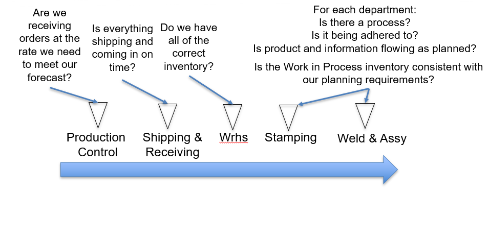 Once we have determined the stops, the next step is to decide what needs to be seen visually at each of these locations to keep apprised of the health of the overall value stream. This assumes that you already know something about the operation and that you don’t have to build a system that will show every possible thing that can go wrong. Much like a physician conducting a routine health exam, we use the tools at our disposal, in concert with our knowledge of the process, to ask questions that will show those things that are more likely to go wrong in this specific value stream, not every possible scenario.
To provide further guidance on the visual aspect of each stop, a manager must be able to see the following at each stop:
- What is the work that should be taking place here?
- Is there a process in place?
- Is the process being adhered to?
- Is product and information flowing as expected?
In addition, there is a fifth question for which we need a visual answer. We save this for last for a very important and practical reason. Most of us come from a background of working within a Management by Objectives (MBO) organization. Because of this our instinct is to start by looking at performance and taking it from there. However, LMS is a Management by Means system. A Management by Means system always starts with the process first, confirms that the process is being adhered to, and then determines whether we are getting the business results from that process or if we need to exercise our problem solving muscles to improve the process. If we skip these steps, we will most likely be making changes to processes that we really don’t understand and that we are not even adhering to. This leads to the fifth question, “How is the value stream performing”?
In order to answer this, it’s necessary to break up the visual management suite into Visual Process Adherence (VPA) tools, as described above, and into Visual Process Performance (VPP) tools. Simply adhering to a process is not enough to achieve process excellence. Instead, we need to assure that we are realizing successful performance and that we are continuously improving, and for this we need to look at adherence first and then performance. To emphasize this point, we are not subordinating performance to adherence. Not in the least. We are only stating that before we can see if the engine is performing well, there must be gas in the tank and oil in the sump.
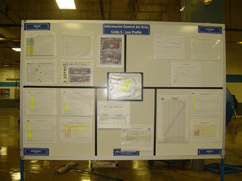
A VPP system consists of a structured set of metrics displayed visually in tiers from the front lines up to the C-suite executive office.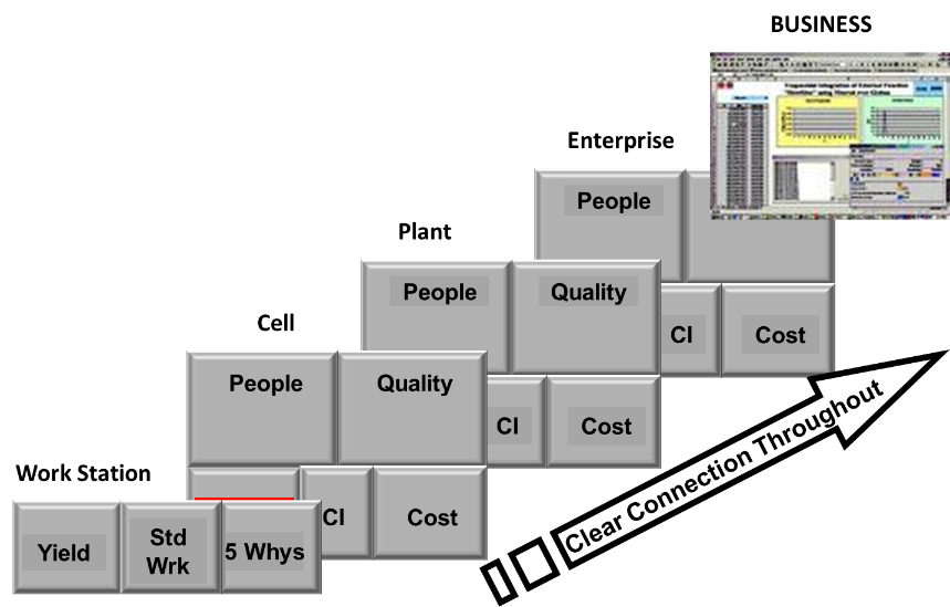
In order to know if we are not only achieving today’s performance goals, but also putting into action our plans for future improvement, we need to look at performance measurement in the five areas of People, Quality, Delivery, Cost, and Continuous Improvement (CI). As Lean emphasizes not just current performance but also tomorrow’s improvement, we present metrics in a manner that shows current performance as well as trends and future objectives.
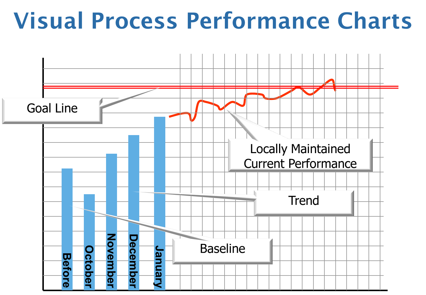
By using a VPP format with these attributes, we try to present as complete a story as possible on a specific metric. Where was it before this year? How has it been trending month by month within the current year? How is it performing at a more granular level in the current month?
It is important to show performance metrics as an entire system, so as not to encourage teams to “squeeze the balloon” or work on one measurement at the expense of the others. For example, if we improve delivered quality but hurt overall cost through excessive use of overtime, rather than improving the process through waste elimination, it is not a Lean improvement. Making business performance improvements through waste elimination lead to improving quality, cost, and delivery at the same time. Thus, we present a complete set of measurements on a board that is structured as follows:
To recap the basic principles of VPP:
- Build leader standard work to review the process before metrics, but treat them with equal importance
- Show each metric as a complete story with history, trend, and current granular performance
- Present a suite of metrics that provide a complete picture of performance in People, Quality, Delivery, Cost, and CI
- Build a tiered set of metrics that provide the organization with a line of sight from the customer at the highest level to the front-line worker
While VPP is sufficient to keep the front line workers informed, it is not enough to run a business. It is necessary to ensure a line of sight from top to bottom in order to foster a shared understanding and concern for the issues that face the organization. To that end, we work to align each tier of these metric boards to present largely the same information, but with increasing scope, as we work up the organization.
It’s important to note that we have consciously left out of this explanation the “management” side of Visual Management. There are a whole host of issues to tease out on Leader Standard Work and Lean Leadership Behaviors. Developing leaders who focus intensely on building the problem-solving muscles of their teams is a topic for another paper. But for the purposes of this publication, suffice it to say, that leaders going out to the workplace can in fact do a lot of harm if they use this new found transparency to blame rather than to become part of the team as a coach.
Digital Technology And Its Impact On Visual Management
 And lastly, no discussion on visual management would be timely in this day and age without proper treatment regarding digital tools in the mix. Businesses have become more geographically dispersed in recent times than they have ever been in the past. Supply chains both internal and external have become much more complex. Both front line workers and leaders have become more physically distant from one another. All of this, combined with the fact the electronic communication has become ubiquitous, makes a deep look at digital options no longer optional. Up until recently MG has rejected many digital platforms for two predominant reasons:
- The systems are complex to learn and use resulting in a barrier to entry and participation. This reduces the number of people in the value stream that can effectively participate in building and improving visual tools, just at the time when we are trying to encourage adoption and ownership. This is a very significant detriment to a Lean transformation that is built on democratizing the transformation process.
- Many systems are far too inflexible and tout their formats for communicating certain information. Graphics that communicate well with one organization will not work well at all with others. Much depends on demographics, culture, and current environment. Traditional means are very flexible in how information is presented. Any electronic media that is brought into play must be equally flexible rather than trying to sell their formats to your organization.
While I’m sure there are other digital visual tools that meet the criteria above, we have selected iObeya as a collaborative partner with The Murli Group in teaching and coaching digital visual management design. Obviously, the choice of IT tools to use is a complex process and it’s up to each organization to make their choices, but we offer the two points outlined above as key considerations for your choices. The advantages of digital tools are, in our opinion, numerous and self-evident. Just be very careful not to let those advantages bind your organization on how best to integrate digital information into your visual work environment.
What Is The Impact Of This Structured Approach?
In this work, we’ve outlined an approach for rigorously specifying, building, and utilizing a visual management system that will work for any type of organization from Government to Pharmaceuticals, to Manufacturing. I can easily imagine that for the uninitiated it seems like way too much work compared to simply visiting other organizations and copying shiny objects that are seen along the way. After all it’s visual, we can see it, right? Our eyes don’t lie, right? Well, maybe not. There are many organizations that popularize simple low effort means of adopting Lean. Some will even communicate their process as only taking minutes each day to execute. Our experience is that successful Lean thinking organizations have taken years to achieve that result. In most cases, those years have been characterized as three steps forward and one step back repeated throughout that period. In every case, if those leaders had it to do over, they would take a more direct path to success, even if that path seemed longer at first. The visual management component of a Lean Management System is no exception. It appears so simple and intuitive, yet so often the simple solutions are the ones that take the longest and are the hardest at which to arrive.
Building a visual management system is not a haphazard exercise like picking up attractive shells off the seashore. We bring home these shells and pile them on the mantel until one day, we realize we have a messy pile of shells that eventually get tossed out with the trash. Visual management has a specific function within LMS. It brings everyone from the CEO to the front line worker together to see the reality of the situation as it truly is at that moment in time. It provides the common platform for discussion on how to make things better for tomorrow by building a community of problem solvers that is more powerful than any small group of experts could ever be. No, it’s not as simple as we all first thought. But it’s oh, so much more powerful than we could have imagined when we first encountered it.
What do YOU think?
Joe Murli
Comments:
by Manish on
12/19/2019 at
3:09:31 AM
The above explanation is very details.
Thanks.
This post is more than 730 days old, further comments have been disabled.
Contact The Murli Group
Find out how we can help strengthen your company from the ground up»

